For many people matte painting is a rather vague term as matte painting has already been around for more than a hundred years. The fundamental task of matte painting is to create or alter scenes in a film, particularly the backgrounds, in order to involve the viewers in the action in a deeper and more believable manner. However a matte painting has no relationship to a collage, even if it might appear to.
by Tony Andreas Rudolph
Sketches– perspective and composition
In order to create a good and/or believable matte painting it is essential to have a basic understanding of composition, colour, perspective and proportion. In this context the images are fundamental stylistic devices.
Before beginning you should think about the composition of the matte painting. What is the aim? Where and when will it appear in the film? It is opportune to create a provisional draft at this point even though it will contain less information than the final image, but still will contain the most important information.
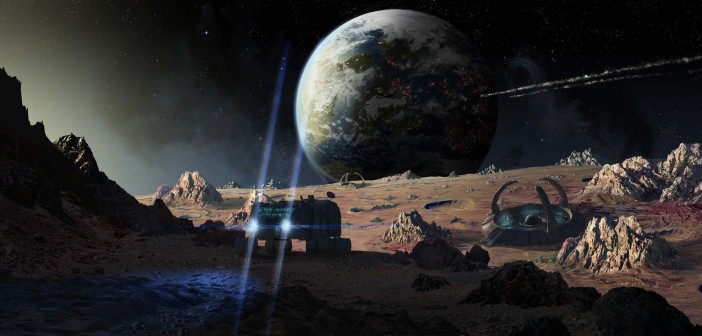
Assuming that the desired scenario takes place in the future: the central action point is a reconnaissance vehicle undertaking an exploratory mission to distant planets. So that the whole thing doesn’t appear so futuristic the planets should take on the characteristics of the moon.
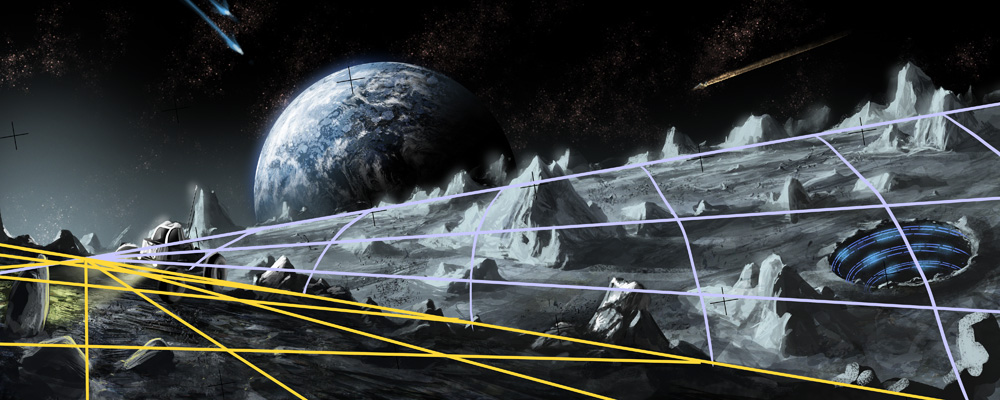
The round standard brush in Photoshop is primarily used for these sketches; custom brushes are rarely used in this context. Stone textures are also used to make some elements more detailed. As the moon is significantly smaller than the earth, the curve of the moon should be clearly visible from very high up, for example a mountain. In addition the starships and the reconnaissance vehicle in the foreground of the picture should be provided with the necessary dynamic. A grid assists in visualising this compositional structure.
In addition to perspective, composition is a fundamental aspect of an image which is why a triangular composition was chosen for this matte painting. If you were to attach a triangle to the sketch it would rest on the reconnaissance vehicle, the moon base and the earth. It is essential that this is taken into consideration when planning the matte painting as exactly where the final focus should lie on each element. The focus of an image can be generated in many different ways, for example use of various levels of detail to capture the viewer’s attention. Very detailed elaborate components emerge strongly thereby setting themselves apart from others. Alternatively this can also be produced with contrasts, for example complementary contrasts, light points and other various effects.
 Matte Painting– Outer Space
In order to gradually implement the created sketches, start with the background.
For wisps of fog a custom cloud brush is used. As there will also be a large collection of planets and solar systems in with the fog a circle brush is used; this brush has settings to alter the frequency and variance of the circles so they can be adapted accordingly. These settings are transferred to the eraser and which is used to subtly edit the fog.
Finally the stars need to be created. The above settings are discarded and painting begins directly on the individual stars with the brush. Many space tutorials on the Internet prefer a faster method, but this is mostly at the expense of self-control. How many stars and where they should be placed is of vital importance for the depth and the focus of the image so you should determine this yourself.
Previously two distances between the stars were created. The fog represents stars which are millions of light years away whereby the last created stars are a distance of approx. 100,000 to 1 million light years away. The stars in close proximity to our solar system are still missing. As these shine more than all the others a little trick is called for. Create a new black layer, use the lens flare filter and position this in the middle of the image. The star is mostly finished, adjust its size and set the layer mode to “Multiply”. Finally duplicate this layer three to four times and position these discreetly. Use a colour correction with “Curves” on the stars which should be less noticeable.
 Matte Painting – the earth
The earth – it seems to be so close to the moon, but is actually far away from it. In order to bring more drama into the composition the earth is greatly enlarged. The difficulty with matte paintings is to nevertheless create the appropriate distance to the moon despite this enlargement so that the credibility of the scenario is retained. This is a welcome resource in this respect when choosing colours. But on the dark sides of the planets you need to ensure that you use as little black as possible.Furthermore it is important to use a lot of detail for the planets and to produce a small curve. The images of NASA.1 are extremely helpful for this.
The curve can be generated using the “Image Warp” transform tool. This step takes a little time. So that the textures do not stick up over the previous circle every texture layer must be created with a layer mask (with cmd+alt+g). Once this is done the planet will be outfitted with rivers and oceans. Here it is important to always to integrate the curves nearby/on the edges. The better this is, the more believable the planet will look in the end. The curves are drawn on a separate layer using a round brush.
The last texturing step for the time being is the North Pole and the snow-capped peaks of the mountains. Like with the continents NASA material can also be drawn on here. Textures which are to be seen on the wind-swept snow-capped peaks are drawn over the whole planet and again customised with the “Image Warp” transform tool. Finally a mask is created and edited. You should build in irregularities in this regard so that the result isn’t perfect and ultimately will look more natural. When doing the mountains be careful that these are random but still unobtrusive. Finally don’t place mountain chains on every continent and country which have the required height for snow. It is particular important in this context to take the level of detail into account: too much detail makes a planet stand out too much, not enough detail and the matte painting isn’t believable.
At this point the texturing is now finished. In adjusting the lighting conditions of the planet it will be incorporated into the image. At this point it pays off to create the seas and the rivers on separate layers. Go back to this and generate a new layer mask. The light side of the planet/the sea brightened by the sun are drawn on this layer using an airbrush with a hardness of 0% in a light yellow colour. This layer is duplicated and laid over the layer with the ground texture. Set the layer style to “Overlay” which results in the texture being coloured yellow and it will also give the appearance of illumination.
Next it’s time for the atmosphere: select the cloud texture and set it to “Screen”. As the texture of the clouds is placed on a black background the layer style makes the black colour information transparent. As a result the clouds are left over and the black colour information completely disappears. As before in the case of the previous textures the texture is warped by the “Image Warp” transform tool so that the curves on the edge are more noticeable than in the middle of the planet.
The final step is to create the blue atmosphere on the indirectly lit side. This is done with a gradient and renewed with the level mask on the circle level. First a mask is created on the layer and then the outstanding areas are erased. The last step is to breathe life into the planet. In this context the round brush is used again and the number of scattering circles is accordingly set slightly higher. Using red the cities are subsequently unobtrusively added. Afterwards a second level is created and again defined as a layer mask; some areas are covered with light blue (normal round brush). The background is now completely finished.
Matte Painting – the moon and the middle ground
Now the moon and with it the main part of the image should be attended to in detail. First we are interested in the moon’s surface. A photo of a desert, which was taken from the website deviantart1 serves as a basic and structure. As images taken from the Internet can quickly result in legal problems it is recommended you compile a database for matte paintings comprising of photos taken yourself. Stock photos often are free to use but each user has their own rules which need to be considered. It took rather a lot of time to find a suitable photo for this matte painting. Despite everything it still must be adjusted to form this composition. The individual channels are selected and edited as part of the “Curves” colour correction. Deviating from the sketch, the surface of the moon will now be done in an orange-blue colour scheme. An intensive structuring of the texture can be created using the Clone Stamp. This copies and distributes some parts of the image accordingly.
As a black gradient is created for the right hand side of the moon (as a layer mask over the moon texture) with 43% opacity this appears as warped. Finally the mountains and craters are designed within the landscape. As the matte painting should have a futuristic tone, harsh types of rock should be chosen. Furthermore the rocks on the moon wear down slower than those on earth as there is neither atmosphere nor water on the moon. After appropriate mountains have been found and colour correction carried out these should look as natural as possible in the environment of the image. When combining the mountains with the moon’s surface this should look less obtrusive. Depicting this on a separate layer which will be laid on top later allows the shape of the mountain to be adjusted accordingly. Mountains in the background of the middle ground which were difficult to identify are likewise drawn in addition to smaller rock formations and craters.
The finished mountains are alienated through multiple copying, overpainting and changing the perspective so that they are considerably different from the original version. It is thereby possible to use one and the same object several times in one image without it being ultimately noticeable. Editing takes up much more time however, because the details are added with a round brush and a round brush with texture. As is evident from the above example image, the small hills were next copied from the original left front side of the mountain to the right hand side of the image and the gaps were filled in afterwards and in doing so the mountain peaks were made a little higher. As this mountain is on a small-scale, the silhouette must be accordingly adjusted to the dark side. The mountain receives its characteristic note, however, first from a detailed light side.
This method can also be used with the other mountains. The primary aim should always be for elements added to look as if they were already part of the image in the beginning. For example a connection between mountain and ground allows the image to flow better in that perception is not interrupted. Even minimal alterations can enhance an image both in quality and appearance.
Although the mountains were incorporated into the landscape they still require some detailed elaboration. The fact that there is no atmosphere on the moon does not make the creation of passable tonal depths easier. It is tremendously important to ensure that the mountains in the background are not too detailed as they will otherwise quickly distract from mountains in the front of the image. Above all spare the details on the dark side of the mountains.
In order to counter the sparse desert flair a little bit small mountains and rocks should be placed on the surface of the moon. As the previous composition regarding image information and the level of detail is a little left-heavy it is now time to work on the right side of the image some more where the main focus is on the foot of the mountains. In order to enhance this area a little it is a good idea to use images of volcanoes where the crust of the split earth can be clearly seen. A rectangle is simply drawn using the selection tool, the corresponding area in the PSD copied and the colour and perspective adjusted. Whilst the colour adjustment is being carried out again in “Curves”, edit the perspective with the transform tool. Finally edit hard edges which have resulted from rough cutting using the airbrush in order to generate a smooth transition. In this step it is barely possible to create a natural, invisible transition but it still is a useful starting point. A round brush or a round brush with texture is most suitable for finalising both transitions and the texture itself. Some details from the photo are omitted so that you don’t have to incorporate so many intricacies. A matte painting can only then work like a photo if the interface between the various stylistic devices such as photos, texturing, painting and 3D cannot be seen.
In order to check the work done up until now and above all the perspective and composition reflect the picture horizontally and then finally vertically. The resulting effect is as simple as it is helpful. As our eyes become accustomed very quickly to the image and the perspective it is increasingly difficult with time to find errors in the perspective. As a result of the reflections the brain will produce a new visual image which is possible to analyse and troubleshoot the image without any preconceived opinions. The final step in this section is to correct any errors found by this method.
 Matte Painting – the foreground
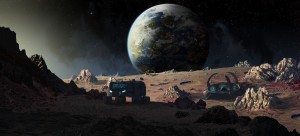
After completing the middle ground it is now time to deal with the foreground. To make working with ground textures as uncomplicated as possible, you have to create a new layer first. With a round brush that is not sensitive to pressure draw a black silhouette from the ground and the mountain on the left. Continue to roughly cut out the photo of a pebble beach with the selection tool and add it to the PSD. As usual, colour and perspective correction have to be carried out. Since we’re looking at the dark side here, you have to take out the warm colours from the image.
Since the stones are difficult to adjust in terms of perspective and size, we need to use another trick: copy the image several times, blur it a bit with the help of the transform tool and adjust it to the desired perspective. In doing so, you have to make sure to only use small stones. For the time being, the rough ground is done, we’ll continue with the details at a later point.
Moving on to the mountain on the left: pick a photo with a lot of debris, such as a shot of a sandstone mountain, roughly cut it out and once again adjust perspective, colour and size. Your pebble beach from the beginning serves as colour and size checkpoint. Do not underestimate the adjustment process because your exact work in this phase will save you time at a later point. Continue by adjusting the corners and edges. Create another mask and use a round brush. The mask is edited with the goal of making the cleanest possible transition between the debris and the sandstone ground. The same applies to the other photos of the mountain where one represents the illuminated area. To produce a harmonious end result, illuminated elements are essential. They give your brain enough information to integrate dark areas three-dimensionally.
Next, focus on the stones on the right hand side of the image and which present a clear delineation from the centre point. Finding stones of similar structure like those in the background can be tricky at times. It is particularly important that they are pointy and have hard, edgy corners. In this context, stones close to the sea or stones close to salt water, primarily from Norway, Egypt and the Croatian-Italian area make sense here. As the salt water has an aggressive impact on the stones, they have hard and sharp edges.
On sandy beaches, there are more stones the closer you get to the water while the amount of sand diminishes accordingly. A fitting image should thus be selected where it is fine above and raw below. Then place the stone into the PSD, put it onto the right hand side and adjust the colour. With the colour correction you should make sure that the stones are a bit darker than the ground as they reflect less light. If this image has been adjusted to your satisfaction, find eight additional photos to work on and repeat the process.
In addition to the mountains in the middle ground, we want to create a clean river between rocks and ground. And again a separate layer is needed. Use a “Chalk Brush” with the goal of creating a sand structure with the help of the brush settings. At first, activate the pressure sensitivity/transfer setting. Then, set the colour dynamic settings “Hue”, “Saturation” and “Brightness Jitter” to 5-10% each. Only put a few details into the stones besides the transitions. To find out if you need details, take a close look at the stones. Evaluating an image can be clearly ascertained by comparing them against a newly created river.
Prior to integrating the 3D Elements, you should fine-tune the foreground. In order to dramatically upgrade the light of the sun, raise the mountain top. Create a new layer and use the lasso tool to make a form that is colour filled with the circle brush. An additional gradient in the foreground darkens the front area. The reason being that the mountain does not stop at the edge of the image. The basic form suggest that it reaches up even higher and is thus exposed to less light.
 Matte Painting – the 3D elements
The 3D elements used here were created in Autodesk Maya. The 3D part takes up some time when looking at the details contained therein. Since the focus is on the pictorial aspect within this matte painting, the 3D elements do not take on a central role here.
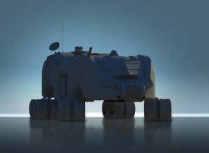
First of all, the moon base needs to be modelled, where the corrugations on the arms are the most detailed area. The design should be as futuristic as possible but clear corners and edges should provide a bit of a balance here. The ball in the middle is the centre of the base. The construction resembles an anthill while the three arms are for energy production. The moon vehicle was modelled at the same time. However, it wasn’t “borrowed“ from the NASA vehicle that was used on the moon. We decided to use some sort of a group transport vehicle with a crane on top. The crane is there to primarily remove debris and to load containers onto the back of the vehicle. The vehicle has large tyres and a large spring deflection so it can deal with the uneven terrain on the moon.
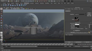
When creating 3D elements, we refrained from texturing these and simply rendered them with a Labert shader in Maya. To adjust them to the image composition perspective wise, we used the so-called “Matching“process. In doing so, an image plane of this matte painting was loaded into a camera. You have to make sure that the image is not modified when making use of perspective modifications in an image plane. The image plane has to stay still at all times – it is only the perspective of the scene itself that changes. To achieve a good result, several minutes if not an entire hour should be invested in the matching. In particular unusual misalignments can lead to confusion. The lighting of the model was realised with the Maya rendering programme “Mental Ray” and the setting “Physical Sun and Sky” and rendered in 4500 x 4500 pixels.
 Matte Painting – inserting the 3D elements
After the 3D elements have been finished, they are placed into the matte painting. If the “Matching“was successful, all you need to do is insert the elements and change them according to the respective scale.
In particular with regards to colour correction, you should experiment a bit with light and dark values to get a good result. If the elements in the dark areas were rendered too bright, you can try and balance this using “Curves”. In addition, we drew a shadow underneath the vehicle to adjust it to the ground and the lighting conditions. The shadows underneath the tyres are darker than those which go off to the right.
Up until now, we refrained from texturizing but at this point it is necessary. Start with the main texture which was created for the 3D elements of the matte painting. Drawing an appropriate sci-fi texture can take some time. After copying and transforming the texture and adjusting the perspective several times it is put around the vehicle like a coat. Afterwards, you set the layer to “Overlay” and adjust the light and dark values using “Curves”. To create the vehicle’s two cockpit layers use the ”Polygonal lasso” tool to cut out windows on a new layer. After adding a further layer mask, you can start drawing on it. The same principle is applied to create the lights.
The two bases in the middle ground of the matte painting are next. They are also rendered via Mental Ray and should be adjusted to the matte painting in terms of colour and contrast. At this point you should refrain from using a lot of black. Since vague details are sufficient in cases of large distances, you don’t need to go back to “Curves” to make modifications.
In the next step, we focus on the details and the lights. At the beginning of the process, we didn’t randomly select this colour for the sun. We wanted to achieve the impression that the sun rises from the horizon of the moon. This does not only make the image more dramatic but also puts some life into the moon base. The complementary colour should put the focus on the base itself. Blue light is particularly associated with advancement and technology and thus brings in a futuristic element.
The night time shot of a building served as model for the lights while the dark areas were darkened even more so that they could be removed completely with the help of layer style “Screen” until only the lighter areas were left (analogue to the cloud formations on earth).
Now it’s just time for the finishing touches: the base is equipped with a few parked and taking-off spaceships, the gate gets some more detail and gets a blue light. By suggesting that the edges of the base sink into the ground of the moon, it is finally integrated as front and middle ground.
Finally, special effects are used to give the matte painting the necessary finish. By using “Shift”, you draw a line in dark blue along the lights of the moon vehicle whereas the ends run out using the “Motion Blur” filter, copying them twice. Make the first line thinner and push it underneath the thicker blue line. Make the second line so thick that it covers both of the lower lines. Afterwards, change the colour from blue to white and set the layer style to “Overlay”. In addition, the white line is shortened a bit. Group the two blue lines, move them up and place them over the other light.
For the ground, you also create an additional layer and draw a feathering light cone which is later put on “Overlay” via the layer styles. Zooming onto the ground, you draw the illuminated edges of the stones. As planned in the sketch, two space ships are placed onto the background of the image while a custom cloud brush is used to create the smoke which was brightened up with the lighting tool in a few areas.
 About the author
Tony Andreas Rudolph is a 23-year-old Visual Effects Artist from Germany who specialises in digital matte painting and concept art. He works under the nickname ZuluSplitter. In 2005 he started out with web design but he soon discovered that his true passion lay in digital painting.Creating matte paintings and concept art proved to be far more challenging than web design so at the beginning of 2008 he finally decided to focus fully on digital art. Since then, he worked on different projects as Book Cover Illustrator, Concept Artist and Matte Painter.At present he is studying Digital Film Making at Middlesex University London via the SAE Institute in Germany. He is a fast learner and a perfectionist as well as a good team player. He enjoys learning new things and likes to work with creative, versatile artists to resolve problems in a new and creative way.Meanwhile he started working for TRIXTER, one of the leading VFX studios in Germany based in Munich, Los Angeles and Berlin which did amazing and photo real visual effects and concept arts for Iron Man 3, Cloud Atlas, The Avengers and for the upcoming feature film Seventh Son. Tony’s working as Concept Artist and Digital Matte Painter there.
Tony is available for freelance work; please feel free to contact him. http://www.zulusplitter.de
Features and Awards
▪ Advanced Photoshop UK – Image of the Week – 2013
▪ Digital Paintbook Artbook – Matte Painting Tutorial – 2012
▪ Ballistic Publishing – Feature in EXPOSÉ 10 – 2012
▪ 2D Artist GERMANY – Feature in the last Issue – 2012
▪ Advanced Photoshop UK – Feature in Issue 97 – 2012
▪ Advanced Photoshop UK – Image of the Week – 2012
▪ Imagine FX – Image of the Day – 2011
▪ Deviant art – Daily Deviation Award – 2011
▪ Advanced Photoshop GERMANY
▪ Feature in the Magazine – 2011
▪ Deviant art – Daily Deviation Award – 2010.

9 Comments
This background technique is great that you reveal here. thanks for this good idea
It’s great and more necessary topic that here I checked. thanks, owner.
This matte painting process is really helpful. A great and useful article you created here thank you for such a brilliant tips.
Wonderful article with its incredible significant zone, I have like to peruse it on account of its normal belief system for improved data territory. At last Thanks a great deal for it.
Hello, I checked this information, just an amazing article, thanks, dear.
Superb technique explained here.
Would be so grateful to you if you can write another article on just image background removal techniques. Although, thanks a lot for sharing this content with all of us.
Something new learnt today. Loved it.
Matte Painting is a technique used for creating the illusion of an environment or object that cannot be captured on film. Thanks for sharing your information.